
Gorgias Analytics: Helpdesk performance reportsUpdated 8 days ago
Who can use this feature?
The Helpdesk performance section of Analytics gives you a granular, customizable, and transparent view of your support operation: performance, workload, quality, and ticket trends. Every report follows the same layout, every metric has a documented formula, and you can customize and save the metrics displayed on every report to meet your team's needs.
We encourage you to explore the new reports before then. If you find that something important to your workflow is missing or unclear, share your feedback with us early, while you can still compare with the previous version. We review all feedback, but we can't commit to building every request.
Access Helpdesk performance analytics section
Helpdesk performance is a section in your Analytics that contains three reports: Overview, Channels, and Help Center. The Overview and Channels reports have tabs along the top that switch the information shown. When you select one of these reports, it opens on its first tab:
- Overview: Support performance, CSAT, Ticket attributes, and Busiest times.
- Channels: Email, Chat, Voice, SMS, and Social.
- Help Center: Shows your most popular articles and search terms on a single page.
To access the reports, follow the steps below:
- From your helpdesk, click the dropdown menu in the top-left corner.
- Select Analytics.
- In the menu, locate Helpdesk performance, then select Overview, Channels, or Help Center.
- Along the top of the Overview or Channels report, click a tab to switch the information shown.
Components of Helpdesk performance reports
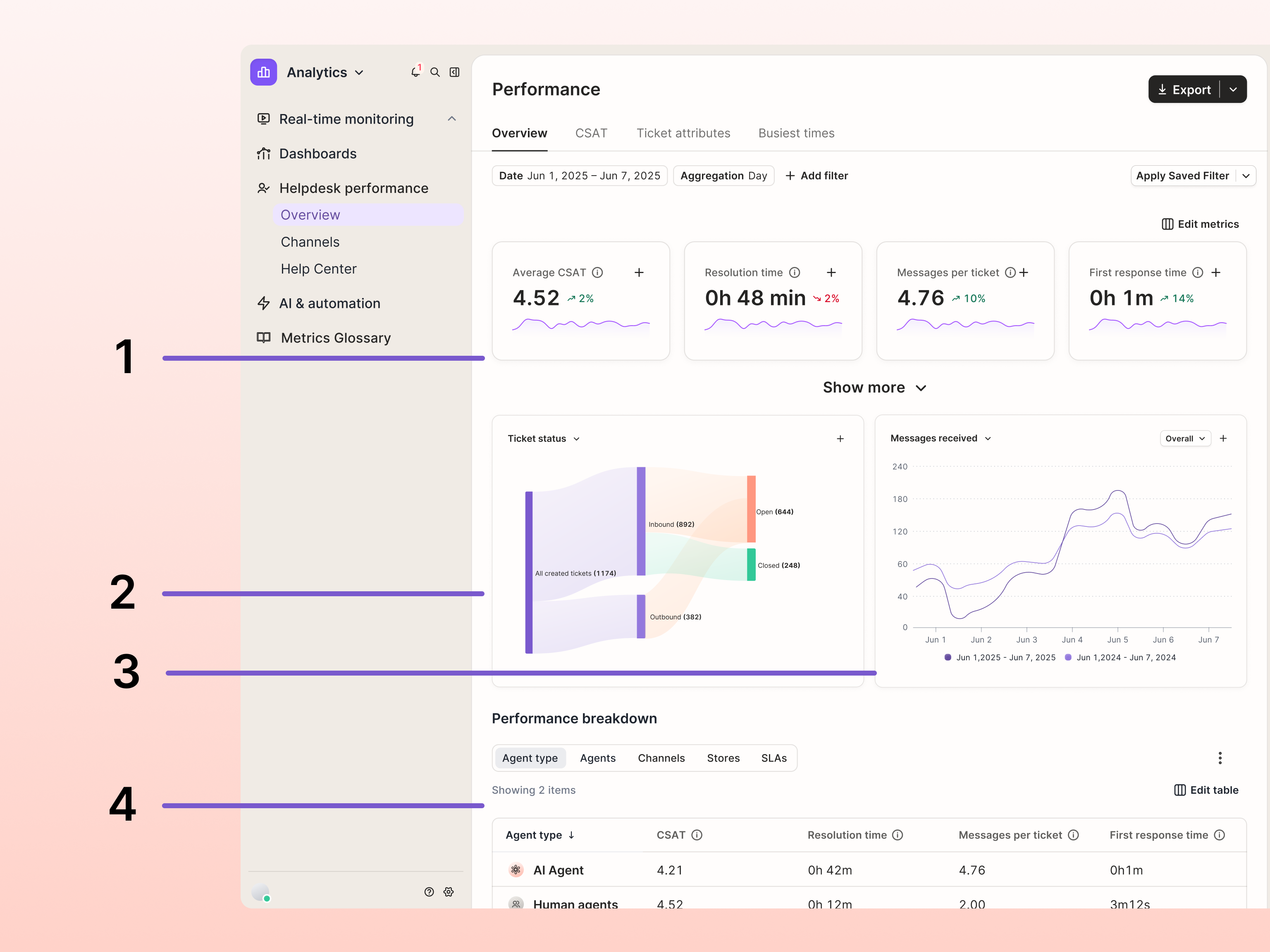
The tabs in each report follow a similar structure.
- Metric cards (top): each card shows the value for the selected date range, a trend badge comparing it to the previous period of the same length, and a small chart of the metric over time.
- Breakdown chart (middle left): splits a metric by channel, store, or agent type, as a bar chart or a Sankey funnel chart.
- Trend chart (middle right): shows how a metric changes across your date range, grouped by the interval set in the Aggregation filter.
- Breakdown table (bottom): compares your metrics across individual contributors, such as agents or teams. Switch between breakdowns using the buttons at the top of the table.
The Date and Aggregation filters always appear at the top of the report.
Customize your reports
When you customize a report, your preferences will be saved and apply next time you open it.
Show or hide metrics
You can choose which metrics to display on the report to keep it relevant to your team's needs.
- Click Edit metrics.
- From the panel, click the toggle next to a metric to show or hide it from the report.
- Click and drag the six-dot icon next to a metric to reorder it, placing your most important metrics first.
- Click Save.
Change what each chart displays
You can change the data that appears in each chart. Where applicable, you can also slice the data by channel, by store, or by agent type.
- Click the title at the top of either chart.
- Select a metric from the dropdown menu.
- When the option is available, a second dropdown menu appears. Click this menu to slice the data by channel, store, or agent type.
Edit data in the breakdown table
You can customize which metrics should appear in the report by adding them as columns to the table.
- In the top-right corner of the table, click Edit table.
- From the panel, click the toggle next to a metric to add or remove it from the table.
- Click and drag the six-dot icon next to a metric to reorder it, placing your most important metrics first.
- Click Save.
Read the charts
How to read a Sankey chart
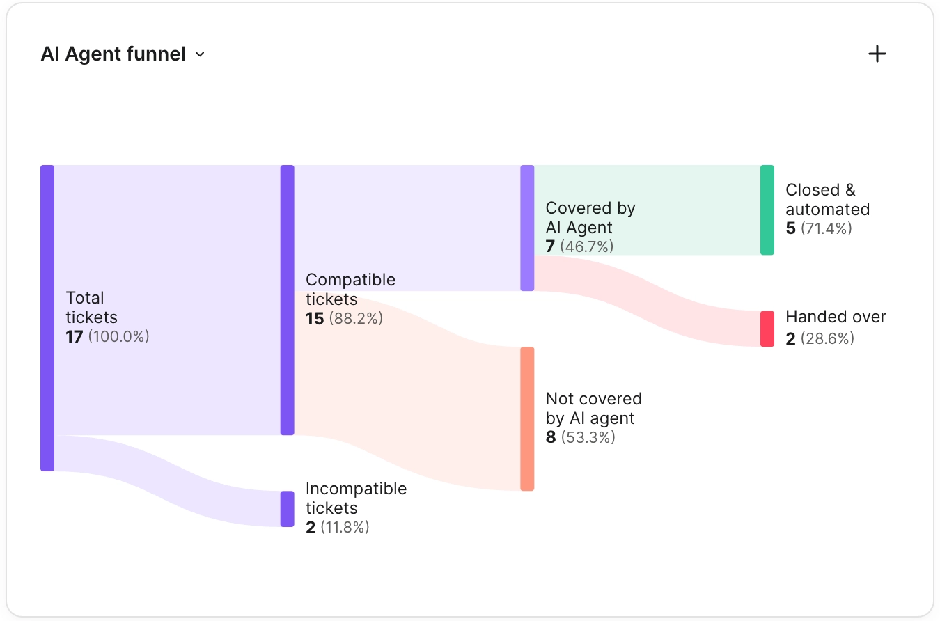
A Sankey chart shows how a total splits into smaller groups. Read it from left to right: the bar on the far left is the total for your date range, and each band flowing out of it carries part of that total to the next group. The thicker the band, the more tickets it represents.
For example, if 1,000 tickets were created and 800 of them were inbound, the band from created tickets to inbound is four times as thick as the band to outbound.
Every ticket ends up in exactly one group on the right, so those groups add up to the total on the left. If a ticket was closed and then reopened during your date range, it counts as reopened, not closed. Watch a 30 second demo video to learn more.
Compare with the same period last year
The trend chart can show your selected date range next to the same dates one year earlier. This helps you tell a real change from a seasonal pattern, like a holiday peak that happens every year.
- Hover over the trend chart. A grey dashed line labeled Previous year appears on the chart.
- Hover over any point on the chart to see this year's value and last year's value side by side, each with its own date.
Compare AI Agent and your team
Use the secondary dropdown menu to slice a chart by agent type or click Agent type at the top of the breakdown table to see how AI Agent and your human agents perform on metrics such as CSAT and response time.
Filter reports
The Date and Aggregation filters always appear at the top of a report. Use the Date filter to show data for a custom range of up to 365 days, or choose a preset such as Today, Past 7 days, Past 30 days, Past 60 days, or Past 90 days.
The Aggregation filter controls the interval used by the performance over time chart. When you adjust your date filter, the available aggregation options update between hour, day, week, and month.
You can also add additional filters to a report to narrow it further — by Channel, Integration, Tag, Agent, Assigned Team, Custom Field, Satisfaction score, Store, Ticket fields, or Auto-QA scores.
- At the top of a report, click Add filter.
- In the menu, select the filter you'd like to apply.
- (Optional) To reuse this filter later, click Save Filters and give it a name.
Reuse a saved filter
- At the top of a report, click Apply Saved Filter.
- Select a filter from the list.
Export report data
You can export a report's data as a CSV file, or export a PDF snapshot of the report with its current filters applied.
- In the top-right corner of a report, click Export.
- Select either Export as CSV or Export as PDF.
Understand your metrics
Every metric has a documented formula in the metric glossary. There are two ways to see it:
- Hover over a metric inside any report to see its formula.
- Open the metric glossary page in the Analytics menu on the left side of the page.
You can also send feedback on a metric's calculation by clicking give feedback in the side panel.
FAQ
Why does the same metric show a different number on two tabs?
Each channel tab filters the metric to that channel's traffic, so Resolution time on the Email tab only counts email and contact form tickets, while Resolution time on the Overview tab counts every channel. Filters you apply also carry across tabs, so check the filter bar before comparing.
Where can I read the exact definition of a metric?
Hover over the title of any metric card or table column to see a short definition, then click View metric details to open the full panel. From there, click View all metric definitions to open the Metrics glossary, which lists every metric with its category and definition in one searchable table.
Why don't my numbers match the previous reports?
As part of this update, every metric was reviewed and redefined based on customer feedback, and each one now has a documented formula in the Metrics glossary. Some values will differ from what you saw in the previous reports. Hover over a metric and click View metric details to see exactly how it's calculated.
Where can I find SLA data?
Go to the Overview report and stay on the Overview tab. Select SLAs in the Performance breakdown table to compare achievement rates between your SLA policies. You can also now track your SLA achievement rate over time. Voice SLAs are on the Voice tab of the Channels report.
Where can I find macro data?
Go to the Overview report, stay on the Overview tab, and select Macros in the Performance breakdown table. Macro usage is now counted per ticket instead of per message, so a macro used several times on the same ticket counts once.
Where can I find CSAT and Auto-QA data?
Go to the Overview report and open the CSAT tab, which brings satisfaction and Auto-QA metrics together. Use the Agents, Channel, and Store tables in the Performance breakdown table to compare scores. To separate AI Agent from your team, slice a chart by agent type. You can also compare CSAT year over year. Auto-QA metrics require an AI Agent subscription.
Which agent gets credit for a CSAT score?
CSAT now goes to the agent assigned to the ticket when the survey was sent, or to the agent who last replied if no one was assigned. Previously, it went to the last agent assigned to the ticket, even if that assignment happened after the survey went out. The score now reflects the agent the customer was actually talking to when they left feedback.
Where can I find tags, ticket fields, and intents?
Go to the Overview report and open the Ticket attributes tab. You can track tags, ticket fields, and intents over time with customizable trend charts, and break them down by store, channel, or agent.
Where can I find Voice data?
Go to the Channels report and open the Voice tab. Every channel now has its own tab in the same report, so you can switch between Email, Chat, Social, Voice, and SMS without leaving the page.
How do I measure agent availability and productivity?
Use Total time in the Agent table, which reflects how long each agent had Gorgias open. Available time, Unavailable time, and your custom statuses break that time down. The per-hour productivity metrics, such as tickets closed per hour, were removed because they relied on the previous online time calculation. Counts such as Closed tickets are still available in the Agent table of the Performance breakdown table.
Where is the Revenue report?
Revenue isn't part of Helpdesk performance. We're building a dedicated revenue report, planned for Q4 2026.
